Think Helvetica
Mon Feb 6 '23
A few years ago, it started becoming a thing for “responsive” websites to have horizontal scroll bars. But, when you scrolled over, the new area revealed itself to be empty. You could scroll up and down the mysterious region of whitespace; wondering why it’s there; imagining its potential. What would it be when it grows up?
Until you’d arrive at some table or iframe overflowing its container on the main part of the page and spilling out into this otherwise void and perfect landscape. It was just an accident.
These days, many web browsers will hide scroll bars until you hover or try to interact with them. But back in ancient times, when these wacky empty regions and horizontal scrolling had just started becoming more common, hiding the scroll bar was a new thing that macOS started doing. And since every web developer has been using macOS since – I don’t know, around the time the Zune came out I guess – web developers didn’t notice horizontal scroll bars when they made pages that weren’t meant to have them.
Today, macOS is still quite popular. And along with horizontal scroll bars, there are websites all over the place with stylesheets that look like this.
/* from the website in the video above */
font-family: -apple-system, BlinkMacSystemFont,
             "Segoe UI", Roboto, Oxygen-Sans,
             Ubuntu, Cantarell,
             "Helvetica Neue", sans-serif

 /* GitHub */
font-family: -apple-system, BlinkMacSystemFont,
             "Segoe UI", "Noto Sans",
             Helvetica, Arial, sans-serif,
             "Apple Color Emoji", "Segoe UI Emoji"

/* stack overflow */
font-family: -apple-system, BlinkMacSystemFont,
             "Segoe UI Adjusted", "Segoe UI",
             "Liberation Sans", sans-serif

/* some random website I started doing contract
 * work on using the latest trendy js/css stack */
font-family: -apple-system, BlinkMacSystemFont,
             Segoe UI, Roboto, Oxygen, Ubuntu,
             Cantarell, Fira Sans, Droid Sans,
             Helvetica Neue, sans-serif
I don’t know if it’s because I’m getting older or because I melted my eyes with laser eye surgery; but, in the last couple years, I’ve been changing my system font like I did my desktop wallpaper and compiz themes when I was a teenager.
After some time, I started suspecting that websites weren’t using my preferred fonts. It turns out, my system fonts were being passed over in favour of this really trendy new font called -apple-system.
I’ve heard that -apple-system necessarily points to a font called San Francisco. And that you must call it -apple-system instead of its actual font name. One explanation suggested for that is to enable things like monospaced numerals. But the font-feature-settings CSS property can specify for monospaced numerals with other fonts without aliases. Probably it only works when fonts support the specific features requested, but it would be surprising if Apple couldn’t figure out how to support it in San Francisco the same way everyone else does in theirs. So this explanation doesn’t make a lot of sense to me.
It’s also possible that -apple-system is an alias for a font particular to the user or device. For instance, serif is different between my laptop and my phone because my phone doesn’t have Papyrus.
In that case, using -apple-system in CSS makes sense as a way for macOS users to have websites that look nice by using their preferred system font. Although, on systems with no -apple-system font, browsers will fall back to Segoe UI or Roboto or Helvetica or Arial; and use one of those basic bitch fonts before ever getting to the system’s configured sans-serif font. Which seems inconsiderate toward non macOS users, but would surprise me less than the alternative hypothetical where Apple created a Helvetica-based font named San Francisco that you can’t use by its actual name and must instead call it -apple-system and which macOS users enjoy so gosh darn much that they’ve decided every non-macOS device that visits a website should use a font that best reproduces Helvetica.
Either way, I don’t really like Helvetica that much.
.config/fontconfig/fonts.conf snippet
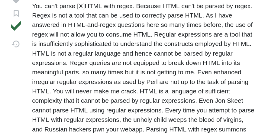
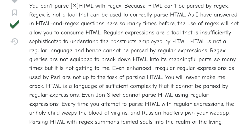
Mapping -apple-system to sans-serif in fonts.conf seems to help de-Helvetica the web.
<alias>
    <family>-apple-system</family>
    <prefer><family>sans-serif</family></prefer>
</alias>
.config/fontconfig/fonts.conf
For context, this is an example of a user fonts.conf where that snippet above is used.
<?xml version="1.0"?>
<!DOCTYPE fontconfig SYSTEM "urn:fontconfig:fonts.dtd">
<fontconfig>
    <alias>
        <family>-apple-system</family>
        <prefer><family>sans-serif</family></prefer>
    </alias>
    <alias>
        <family>ui-monospace</family>
        <prefer><family>monospace</family></prefer>
    </alias>
    <alias>
        <family>monospace</family>
        <prefer><family>Comic Neue</family></prefer>
    </alias>
    <alias>
        <family>sans-serif</family>
        <prefer><family>Comic Neue</family></prefer>
    </alias>
    <alias>
        <family>serif</family>
        <prefer><family>Comic Neue</family></prefer>
    </alias>
</fontconfig>
before

after

Also, I don’t have anything against specific fonts on websites generally. It think they’re cool when they’re on purpose. That’s how I find new fonts that I like. Like Quicksand. And Brandon on kingarthurbaking.com. It’s nice to see a thing that looks some way because someone gave a flippin’ hoot about it looking that way.