Exploding the Civilization IV User Interface
Sat Jun 8 '24
This is a sequel to the previous post on this blog; HTML as a configuration file format.
When Civilization IV was released, 2005, people generally had smaller computer screens and lower resolutions than what we use on desktop computers today.
Steam, an app store for computer games, has a survey that samples the hardware of some of their users. In 2008, the most common primary display resolutions were 1024x768 at 25% adoption, 1280x1024 also at 25%, followed by 1680x1050 at 14%. Compared to a more recent survey in 2024, with 1920x1080 at 58%, followed by 2560x1440 at 20%.
Resolutions have increased but so have display sizes. These days, we have more pixels on our monitors, but they tend to be larger monitors. The pixel density of both a 24” 1920x1080 display and a 32” 2560x1440 is 92 PPI. Though, it’s not uncommon to find 27” 2560x1440 displays with a PPI of 109.
In olden times, you could get 92 PPI from a 14” 1024x768 display or 96 PPI on a 17” 1280x1024 display. Or 98 PPI from a 15.4” 1280x800 display you might find in a laptop.
This is a monitor recommendation published in a 1995 issue of PC Magazine for a 17” 1280x1024 display.

Admittedly, pixel density hasn’t really changed significantly for most people. Particularly on the desktop. A 4K (3840x2160) 27” display has a pixel density of 163 PPI. But that isn’t common. And my phone has a 5.5” 1920x1080 display with a density of 401 PPI. But who needs to play Civilization IV on their phone?
The issue here is that a game or application rendering text at a specific size in pixels will produce text that is physically smaller, and more difficult to read, on the 4K display compared to a display with ninty-something PPI.
Often, software has ways to detect display density and scaling preferences and render larger text and scale up other parts of the user interface appropriately. That’s why the text on your phone isn’t so insanely small that you can’t read it. And although games have historically lagged behind the rest of software in supporting higher pixel densities, it’s common these days to get pretty good support for higher PPI displays in games.
And for good cause. Even though 4K displays are still not common, there seems to be a growing market for handheld gaming devices. Like the Steam Deck with 216 PPI at 7” 1280x800, the Asus ROG Ally with 315 PPI at 7” 1920x1080, and the Lenovo Legion Go with 343 PPI on its 8.8” 2560x1600 display.
These devices aim to run games that were designed for the Windows desktop, either by running the Windows operating system itself or by running Linux and using an “emulation” layer like Proton. This is in contrast with a smartphone, where games are designed with the expectation that they’re being played on a smartphone sized touch screen.
So, as handheld gaming hardware become more of a thing, game developers shipping for desktop computers running Windows or Linux have the opportunity to reach a market of handheld gaming users if they can make their game enjoyable on higher PPI displays.
I should point out that these handheld gaming devices are intended to be closer to your face than a typical monitor. So there’s an argument that the higher pixel density doesn’t matter quite so much. And this might be true for the Steam Deck. But for other devices, with PPI in the three hundreds, I think the pixel density is high enough that games need to account for it. But that’s just my guess, I haven’t used any of these devices personally. When someone buys one for me, I will run Civilization IV on it and update this post.
upscaling the hard way
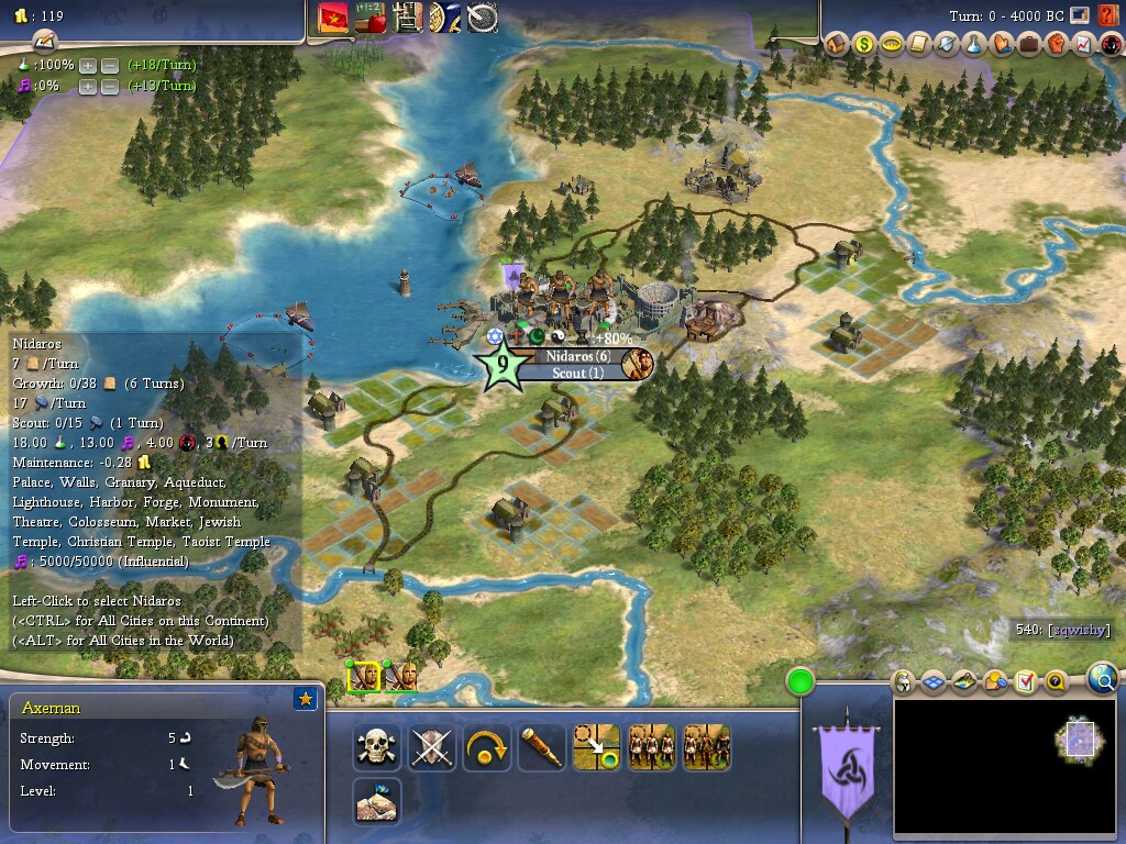
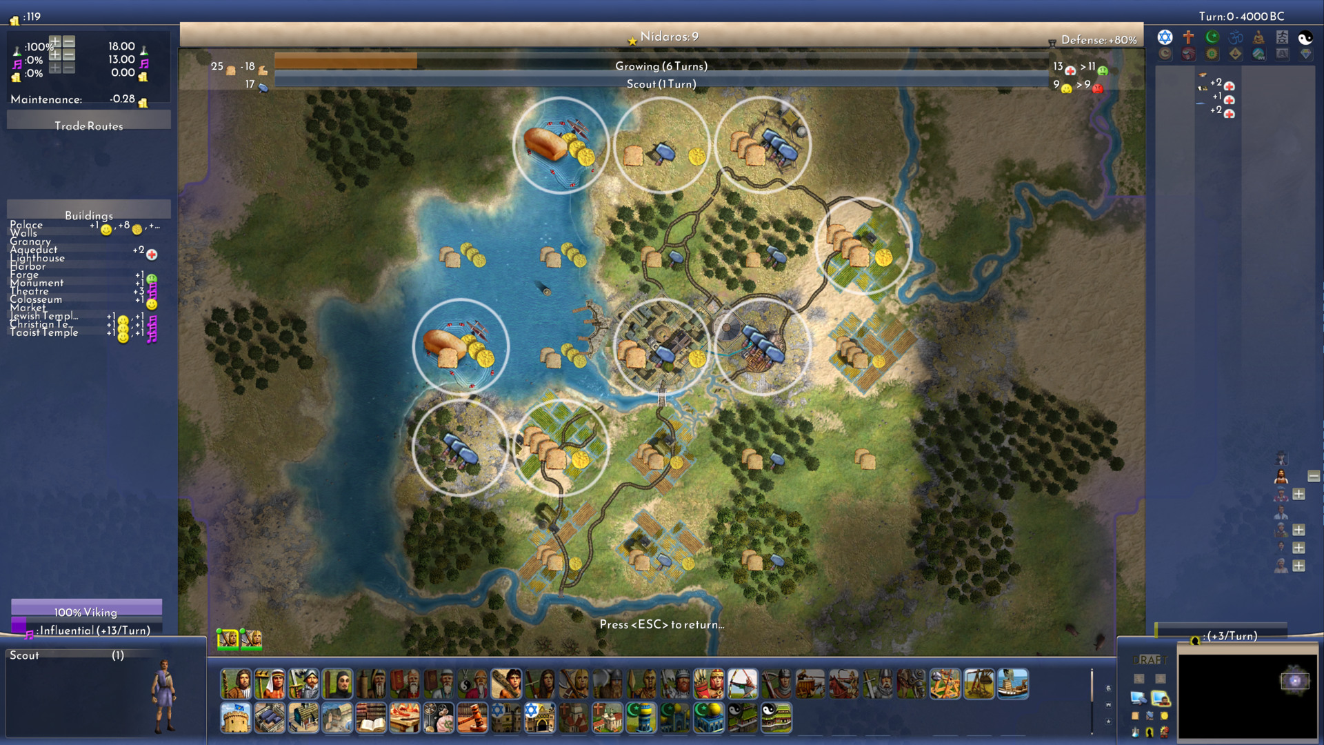
Civilization IV supports a display resolution as low as 1024x768. That is 38% of 1920x1080.

Much of the user interface in Civilization IV is laid out around the edges of the display; with the center reserved mostly for viewing the world map, with occasional popup or dialog screen. The code has special cases about how to lay out the interface at 1024x768. Beyond that, the layout scales by increasing the distance between user interface elements, along the corners and edges, rather than increasing the size of those elements. This makes a lot of sense if the physical size of the display increases with resolution – which it has. But if you want to play Civilization IV on a display with high pixel density, then text, buttons, and other graphics might start to look uncomfortably small.
In the previous post, I mentioned that most of the game’s font is rendered from a TTF file. And since a TTF describes a font as vectors, like paths rather than pixels, software can render these fonts at any size reasonably well. The game has theme files that tell the game what font file to load and what font size to to use. It’s easy to modify the theme file to use a different font file or to draw it at a larger size.
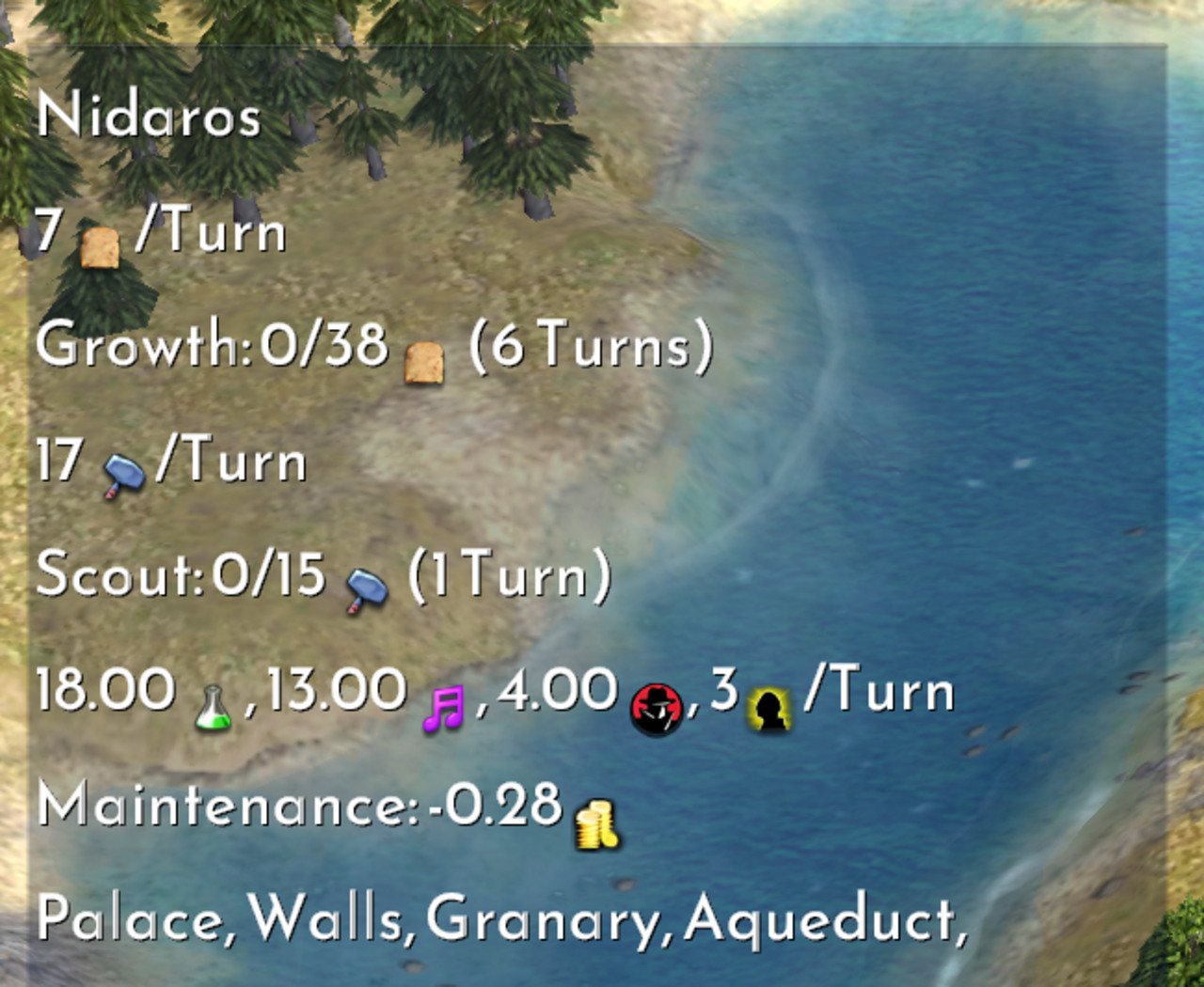
But this doesn’t affect anything using GameFont.tga; including the city bars shown earlier and icons shown inline with the TTF text.
But, using the tooling mentioned in the previous post, we can unpack the vanilla GameFont.tga atlas, increase the size of the individual icon images, and repack it with own text atlas rendered at a larger font size.
The game ships with version 2.4 of the CPython interpreter and includes Python bindings to parts of the game systems so that user interface screens can be written in Python. So a lot, but not all, of the vanilla user interface is written in Python and available for modification. But it’s also written with a lot of fixed sizes. Modifying that code to draw the interface based on a scaling factor would require many changes. And you would need to understand the code to do a good job. And there are thousands of lines that look like this …
screen.addTableControlGFC( "SelectedCityText", 3, 10, yResolution - 139, 183, 128, False, False, 32, 32, TableStyles.TABLE_STYLE_STANDARD )… or like this …
iBtnX = xResolution - 284
iBtnY = yResolution - 177

iBtnW        = 22
iBtnWa       = 20
iBtnH        = 24
iBtnHa       = 27

i = 0
szButtonID = "Emphasize" + str(i)
screen.addCheckBoxGFC( szButtonID, "", "", iBtnX, iBtnY, iBtnW, iBtnH, WidgetTypes.WIDGET_EMPHASIZE, i, -1, ButtonStyles.BUTTON_STYLE_LABEL )

...

i+=1
szButtonID = "Emphasize" + str(i)
screen.addCheckBoxGFC( szButtonID, "", "", iBtnX+iBtnW, iBtnY, iBtnWa, iBtnH, WidgetTypes.WIDGET_EMPHASIZE, i, -1, ButtonStyles.BUTTON_STYLE_LABEL )

...

i+=1
szButtonID = "Emphasize" + str(i)
screen.addCheckBoxGFC( szButtonID, "", "", iBtnX+iBtnW+iBtnWa, iBtnY, iBtnW, iBtnH, WidgetTypes.WIDGET_EMPHASIZE, i, -1, ButtonStyles.BUTTON_STYLE_LABEL )
It’s the sort of thing where, to do a good job, you wouldn’t just add a bit of number scaling math in-line to this. It’s already mucky – difficult to read and think about. Ideally, you would use the opportunity to change how these interfaces are coded to improve readability[1].
One drawback of a big rewrite like that, as tempting as rewrites can be, is that any mods that extended the vanilla user interface and repeated the patterns in it would also need to be adjusted to work with a scaling factor. So, lacking in any constitution whatsoever, I opted for a very lazy way of rescaling the user interface.
The game’s API for building a user interface in Python is done with one class called CyGInterfaceScreen. The class is a container for all sort of stuff; getting the resolution, adding and showing buttons, or checkboxes, comboboxes, tables. Many methods take a number of pixels as parameters, like for the position or size of widgets. Some methods return a number of pixels, for things like the width or resolution of the game window.
I made a fake CyGInterfaceScreen, with all the same methods as the real one, that forwards each method call to the real CyGInterfaceScreen, but fudges the numbers a little bit to trick the interface code into thinking that our display as a lower resolution than it really is. Swap out the real CyGInterfaceScreen for this fake one and, whenever something asks it the resolution of the display, it will ask the real CyGInterfaceScreen for the resolution but then divide it some factor when returning the value. And if it’s asked to put a button at a specific location, it will multiply the coordinates by that same factor before passing it along to the real CyGInterfaceScreen.
Admittedly, this result isn’t perfect. But it was very easy to do. There are a lot of places where the scaling doesn’t have an affect because the sizes don’t go through this the CyGInterfaceScreen in Python; they’re defined in a theme file somewhere – in the same general area where we changed the font size, in fact.
In the corner of that screenshot we see an example of how the game renders icons from GameFont.tga inline with text the TTF font.
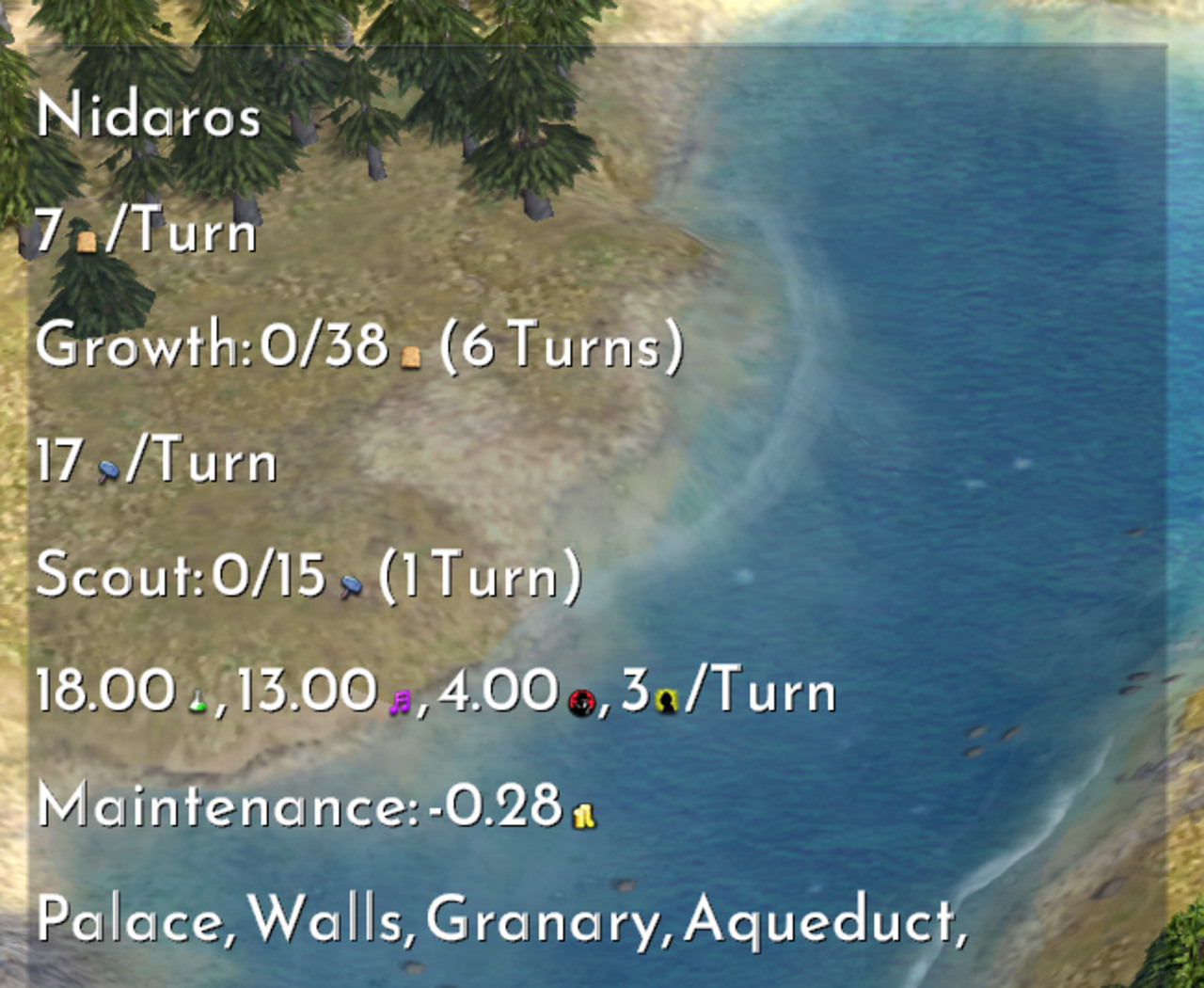
We can unpack GameFont.tga, increase the scale of the icons, and repack it.
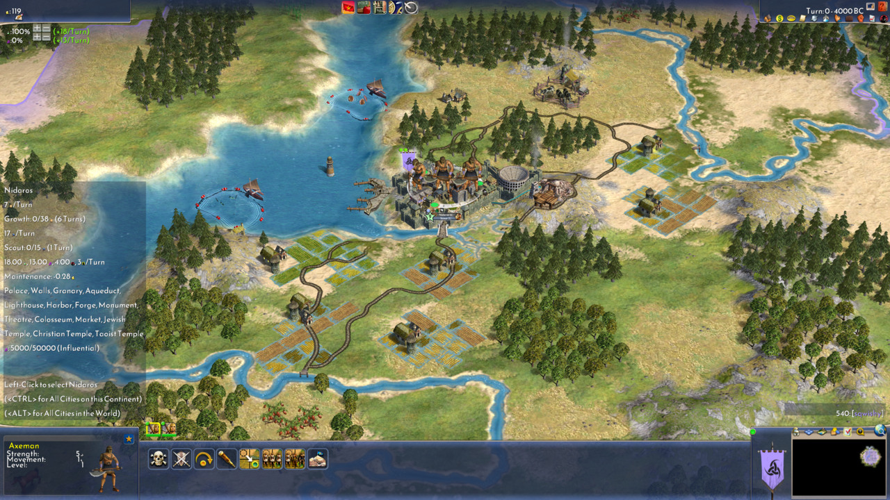
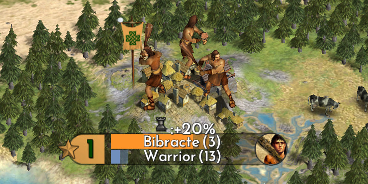
Remember the city bar from the previous post? It uses the GameFont.tga for its text and icons. But the rest of the city bar graphic come from other textures and a 3D model.
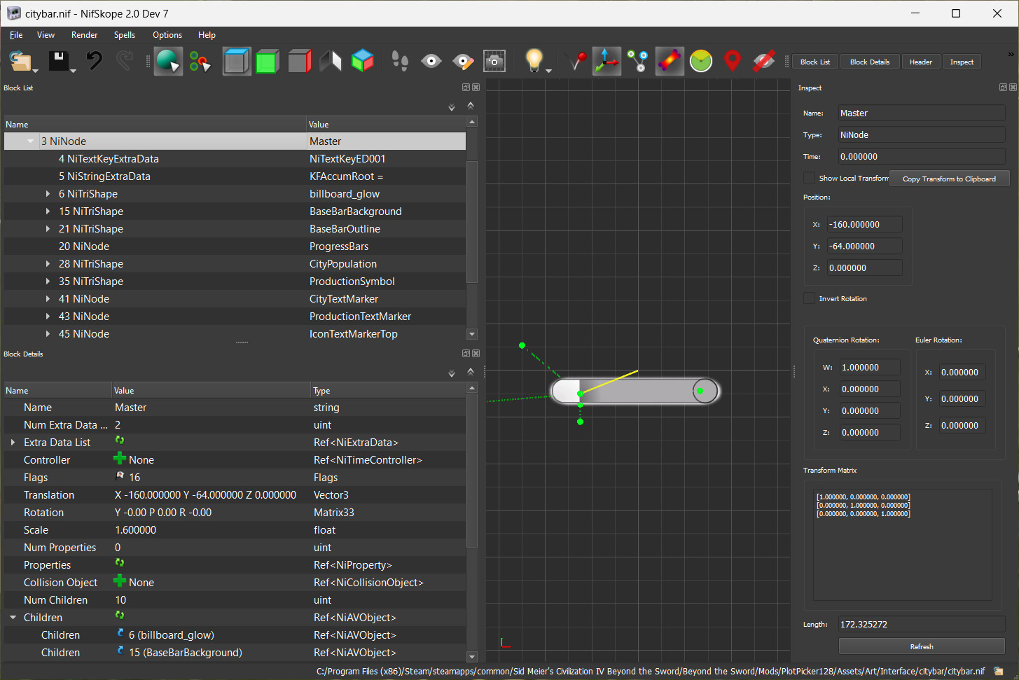
Civilization IV was built on an engine called Gamebryo. The same engine Bethesda used in for some of their ‘00 releases, Morrowind, Oblivion, and Fallout 3. Bethesda later used Gamebryo as a basis for their Creation Engine in their following titles like Skyrim.
So, NifSkope, a tool still used today to edit files for 3D information in Fallout 4 and Skyrim, is also used to edit the same kind of files in Civilization IV for things like unit graphics. Or the city bar.
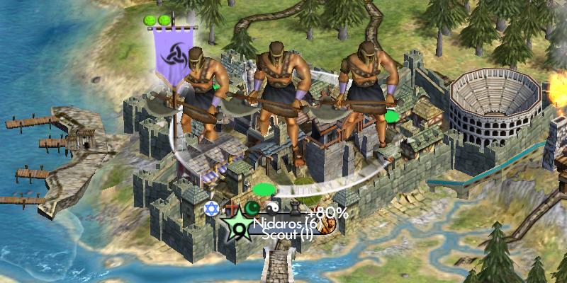
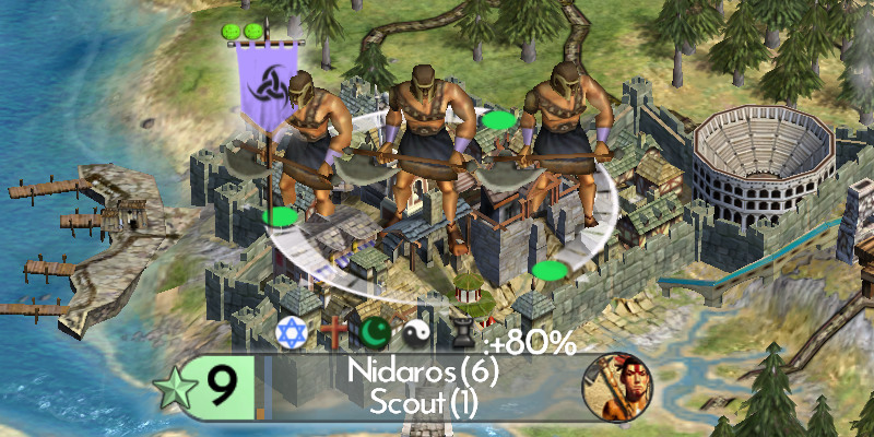
Part of this change was moving and rotating the growth and production progress bars. In vanilla, they are horizontal behind the city name and production text. This can cause readability issues, for the city name in particular, as the bar fills up and reduces contrast between the text and the colour of the progress bar itself.
I borrowed from how Civilization V (the best looking Civilization game so far) does their city bars; shown below. My edit certainly isn’t as spiffy, but it’s an improvement of sorts.
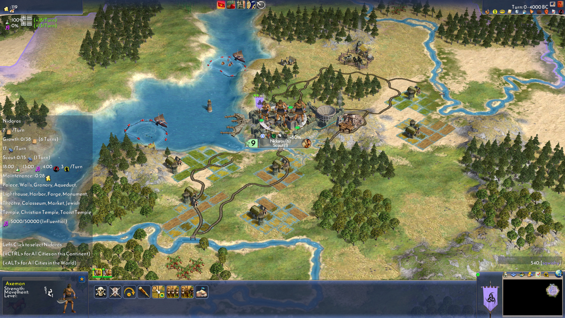
Below is the result of the main screen after all these changes. It’s pretty messed up, honestly. It’s a bit tragic.
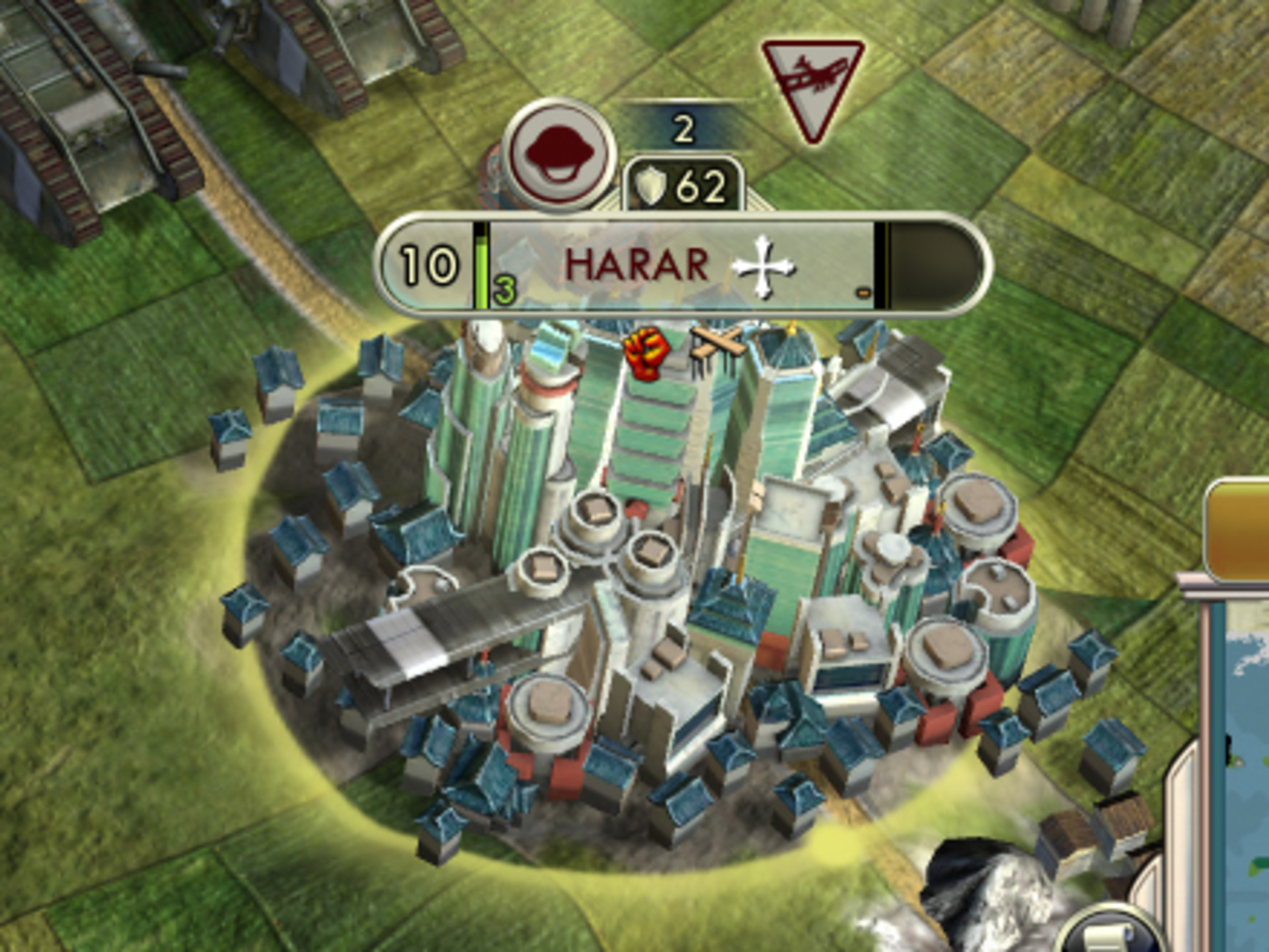
When you click in to a city, it this is what it looks like.
It’s a bit silly, but it’s also not totally unplayable. There is a lot of room for improvement. Some are simple changes to sizes defined in theme files. Other stuff I don’t understand, like the extreme whitespace above and below lines, though it seems to vary with the font used. I think the largest and most looming mystery so far is why the icons aren’t properly aligned vertically in the text.
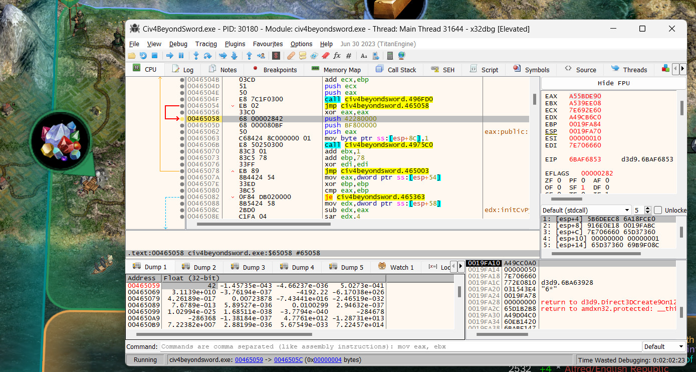
Furthermore, some user interface elements don’t scale with the techniques covered here so far; either through theme files, font size, or the CyGInterfaceScreen. One of those are the resource bubbles; little pins on the map that help point out important resources. f1rpo, mentioned earlier as the author of the Advanced Civ mod, indicated in this thread on civfanatics.com that there are instructions in the game executable that can be modified to affect the size of these resource bubble pins.
It’s possible to do this modification at runtime without changing the game executable on disk; since, when the game is run, its program is copied into a memory and it can be modified in memory instead of on disk.
Below are some old screenshots that shows the modification being made manually through a debugger.
The instruction being executed there is push 42.f.
The value pushed on to the stack by the push instruction is displayed as a floating point in the bottom left of the debugger; under the dump pane.
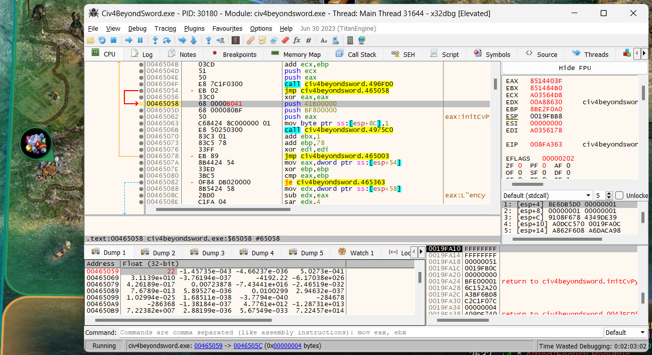
In this example, reducing the number pushed on the stack, from 42 to 22, shrinks the bubble, shown on the left edge of both screenshots.
It should be pretty easy to make this kind of change from the game itself, instead of manually from a debugger. The ctypes package in Python’s standard library would be great for this. Unfortunately, ctypes was added in Python 2.5 and the game ships with version 2.4. So I had a go at writing a C extension, importable in Python 2.4, to help read and write to arbitrary memory regions.
It’s very simple. It has functions for getting and setting various types of values. So we could accomplish what was shown in the debugger above by writing the following:
PlotPinScale.setFloat(0x465059, 22.0)It also lets you pass in a format string from the struct package in Python to read or write a tuple of values, instead of one value at a time.
Remember the contrast issue with the white text on that orange background on the city bar? One thing you can do with the text generated from the browser’s canvas API, in atlast.html from the previous post, is add an outline and a text shadow. That helps a lot with the contrast.
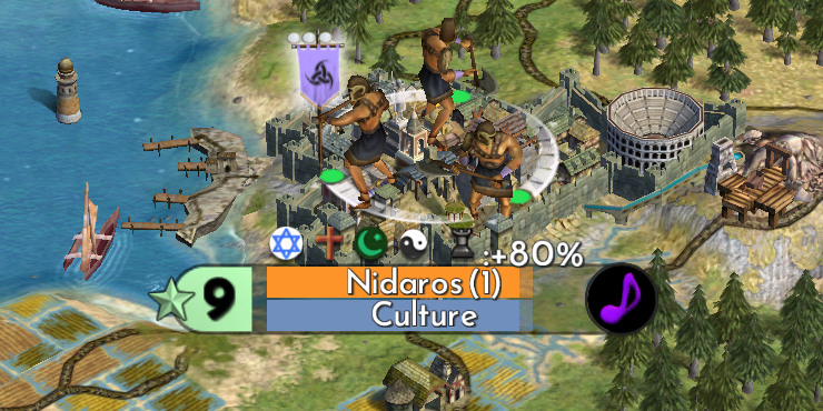
Unfortunately, this makes the city size, the big number “9” on the left of the image, look super crunchy. This is because it’s a black nine with a black shadow.
The colours used for the city bar here are in a function in a file called cvgamecoredll.dll. The source for that DLL was made public by the Civilization developers in order to allow modders to do more stuff. That’s really cool. We could modify the source code to change the colour of the number nine and recompile the DLL. But I don’t know how work a C compiler on Windows. And I’m too old and full of micro-plastics to learn new things.
If we open up that module in x64dbg, we can see instructions moving the colour black on to the stack. When viewing the player’s cities, like the one shown in the screenshot earlier, this function copies those values from the stack to a return value later on.
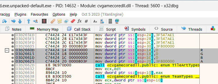
The memory address of this instruction is 03d2660d.
Though, since these instructions are located in the cvgamecoredll.dll module, and the base address of that module may be different between launches of the game executable, those instructions won’t always be at that address.
movr, r, movg, g, movb, b = \
    PlotPinScale.getValues(0x03d9660d, "=4sf4sf4sf")

assert movr == "\xc7\x44\x24\x14"

PlotPinScale.setValues(0x03d9660d, "=4sf4sf4sf",
    movr, 1, movg, 1, movb, 1)
This uses a struct format string to tell Python that we want to read the memory as a tuple of six values.
Each line, highlighted in the image above, is eight bytes.
The first four bytes of the instruction are read as a string in Python; 4s.
The other four bytes, for the instruction source operand, is translated as a float; f.
We do that three times, once for each R G B component, and use = to specify alignment to get =4sf4sf4sf.
Since the instructions are unpacked as strings, we can compare them to strings in Python to check that the instructions at the address match what we expect. That’s the assert statement in the illustration above.
Finally, we can overwrite that memory with new instructions that use the colour white instead of black by setting the source operand of each instruction to 1 instead of 0.

It’s not a complete solution. When viewing cities belonging to other empires, the empire colours are used. And you can end up with the same problem.
But I just needed an excuse to show an example of using the PlotPinScale module to unpack and pack multiple Python values at a time from a single read or write.
And, again, a mod author interested in doing this would just change the cvgamecoredll.dll source code and recompile it.

I was going to put something here about how video game modding is an interesting social activity for cultured and sophisticated persons with refined tastes – and somehow not just a outlet for the crazy, obsessed, and fixated. But I couldn’t figure out how to make that be words. And maybe it isn’t even true.
It’s just that, sometimes, someone will go outside, take a picture of bark on a tree or some rocks, and then import it into the video game so that the video game trees and rocks look nicer than they were before. And do the same thing for snow-covered trees, and spend time trying to make the snow on their tree match everybody else’s snow texture. Which is futile because there are a dozen different snow textures and making everyone happy is not gonna happen, especially if they’re the sort of people who are hand-picking their snow textures.
But people do it anyway for some reason.
And sometimes someone makes something that you didn’t expect you’d enjoy and didn’t know you wanted.
